Kingsthorpe Community Library
Visual Identity | Branding
Branding materials for a community library. The client required a ‘friendly’ identity that feels ‘welcoming and evokes excitement’.
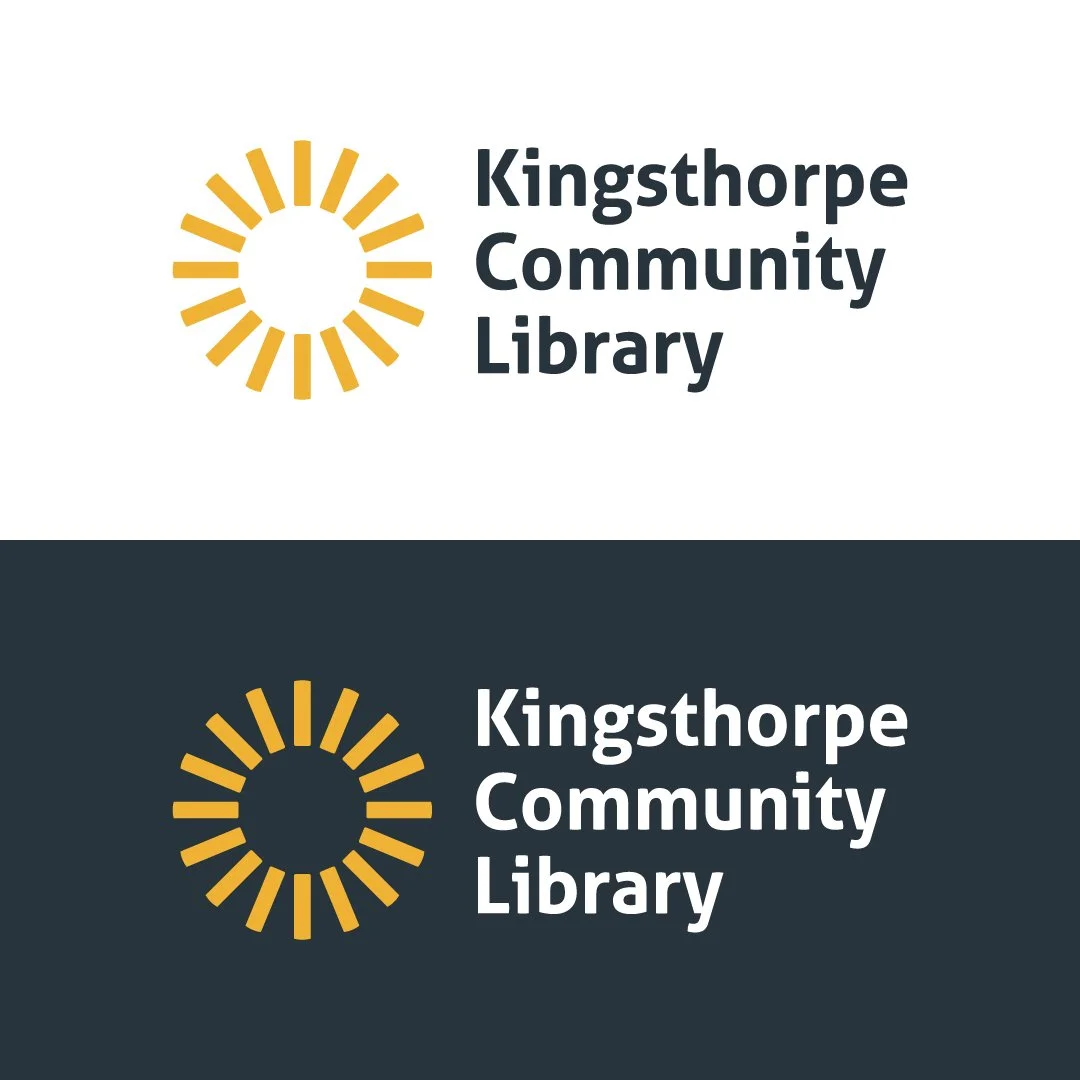
The logo symbolises happiness and new beginnings.
The logo involves the arrangement of books to portray the concept of a sunrise, a symbol for new beginnings. A concept well suited for this sector. The horizontal version expands on the logomark to create a full sun to maintain balance.


